
Cosmos
Restaurant
Designing a premium, modern and trustworthy packaging system for a ready to cook product line one that reflects quality, natural ingredients, and a delightful cooking experience delivered straight to your kitchen.
Designing a premium, modern and trustworthy packaging system for a ready to cook product line one that reflects quality, natural ingredients, and a delightful cooking experience delivered straight to your kitchen.
Developed by
Ammar
Direction
Brand Identity
Craft
Packaging Design
Year
Sports & Entertainment
Challenge
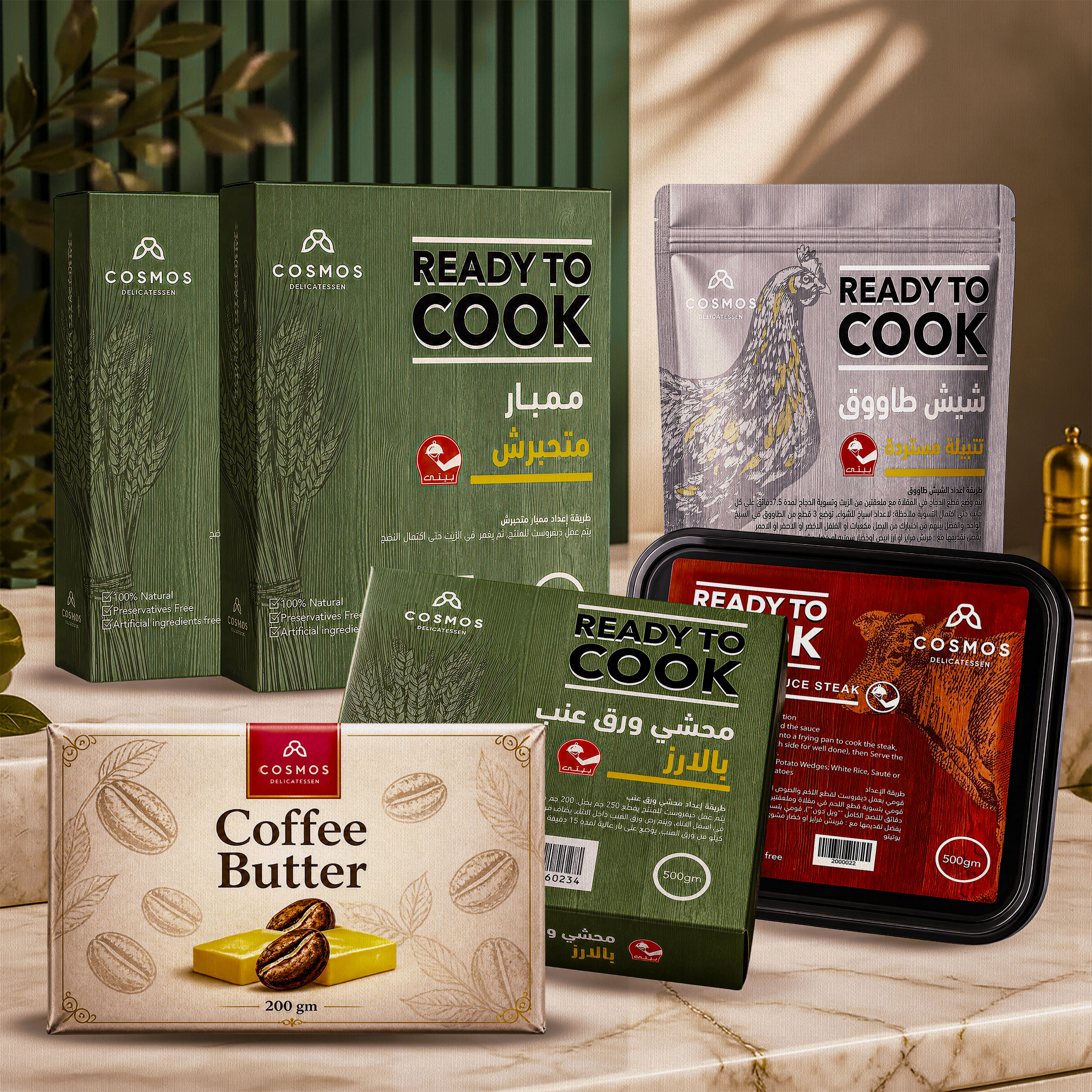
The ready to cook category sits in a difficult spot in food retail. Shoppers want the convenience of pre prepped meals without the feel of processed food, but most packaging in the category leans one way at the expense of the other budget RTC brands read as utilitarian, while premium options often feel imported and disconnected from local food culture.
For Cosmos Restaurant, the brief was threefold: carry the warmth and credibility of a trusted restaurant brand into retail packaging, communicate freshness and quality at a glance in an Arabic speaking market, and build a system that scales across a growing lineup from marinated meats to seasoned spice blends without losing visual coherence.
The packaging also had to work across multiple formats stand up pouches, rigid trays, and folding cartons each with different structural constraints, while still feeling unmistakably Cosmos.
The ready to cook category sits in a difficult spot in food retail. Shoppers want the convenience of pre prepped meals without the feel of processed food, but most packaging in the category leans one way at the expense of the other budget RTC brands read as utilitarian, while premium options often feel imported and disconnected from local food culture.
For Cosmos Restaurant, the brief was threefold: carry the warmth and credibility of a trusted restaurant brand into retail packaging, communicate freshness and quality at a glance in an Arabic speaking market, and build a system that scales across a growing lineup from marinated meats to seasoned spice blends without losing visual coherence.
The packaging also had to work across multiple formats stand up pouches, rigid trays, and folding cartons each with different structural constraints, while still feeling unmistakably Cosmos.
Solution
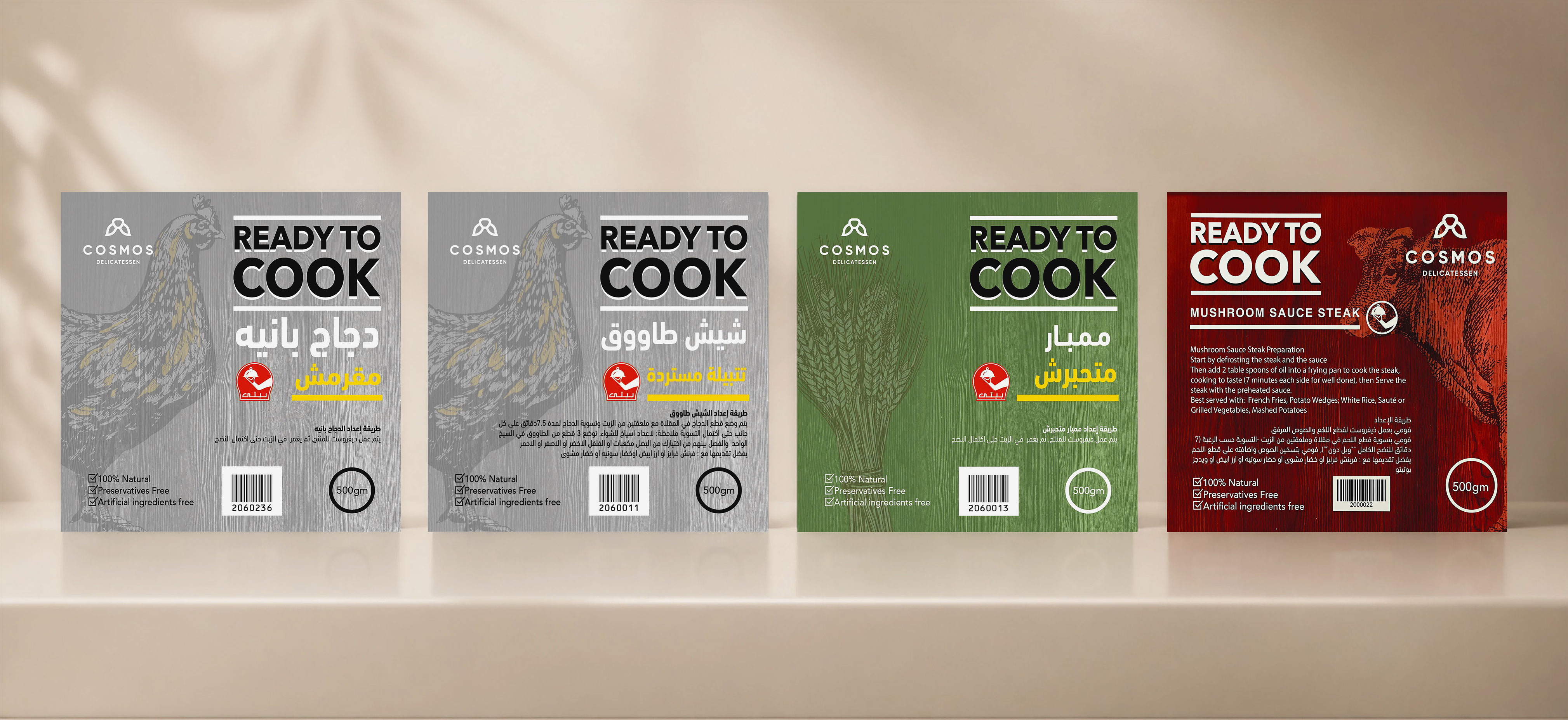
The system centers on a bold, two-tone color architecture deep forest green for the primary brand identity, rich burgundy red for the product sub range anchored by a white "Ready to Cook" typographic lockup built for instant shelf recognition.
The Cosmos logomark, a minimal geometric emblem, sits consistently in the top corner, carrying restaurant grade credibility into every format. Arabic product names are set in an expressive, high contrast script that connects with the regional audience while holding the brand's premium positioning.
The system centers on a bold, two-tone color architecture deep forest green for the primary brand identity, rich burgundy red for the product sub range anchored by a white "Ready to Cook" typographic lockup built for instant shelf recognition.
The Cosmos logomark, a minimal geometric emblem, sits consistently in the top corner, carrying restaurant grade credibility into every format. Arabic product names are set in an expressive, high contrast script that connects with the regional audience while holding the brand's premium positioning.


Visual Language
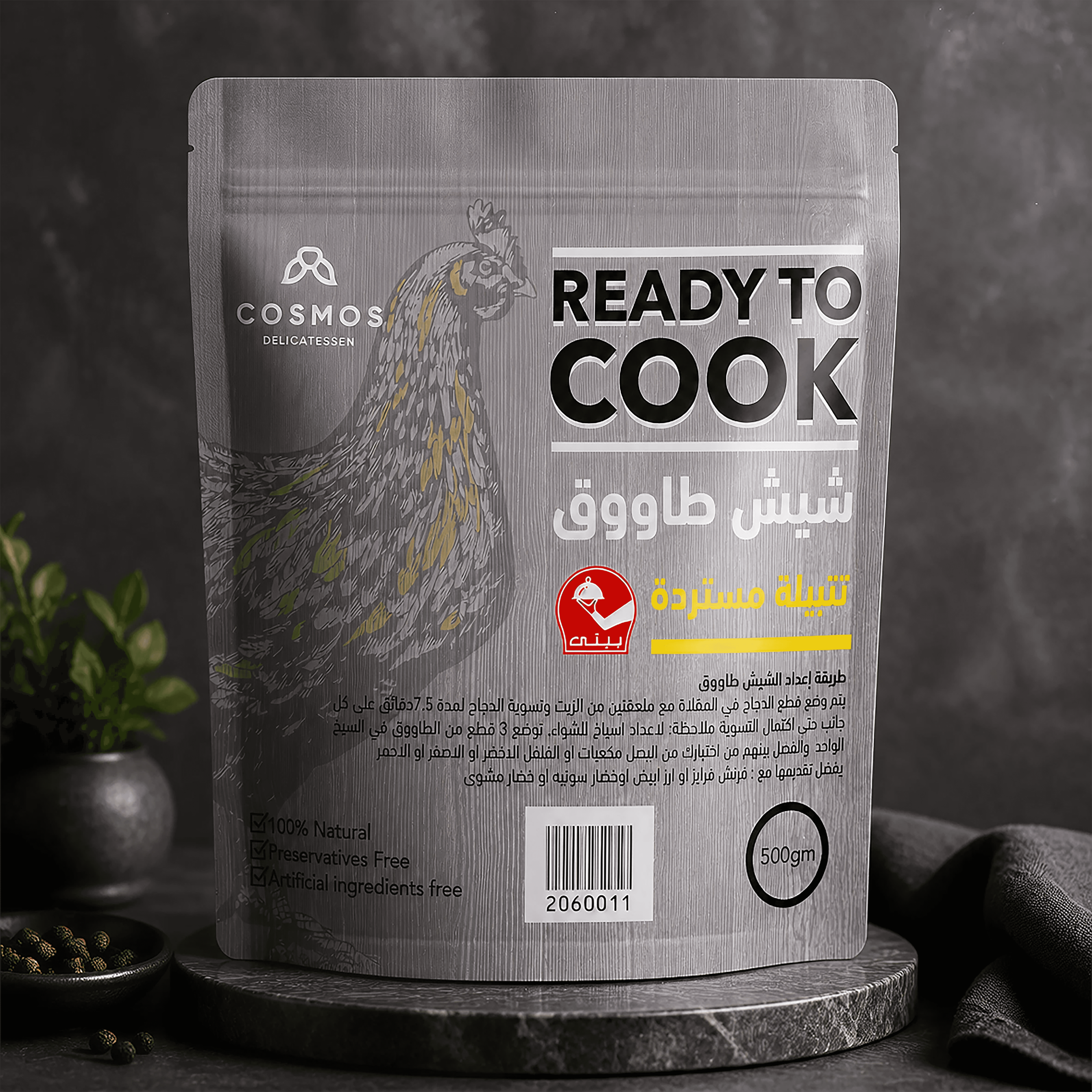
The system is built on a bold, two tone color architecture deep forest green as the primary brand color, rich burgundy red for the product sub range creating instant shelf recognition across formats.
Typography: a white "Ready to Cook" typographic lockup anchors every pack, paired with an expressive, high contrast Arabic script for product names
Logomark: a minimal geometric emblem, placed consistently in the top corner across every SKU
Materials & format: the palette and lockup are built to hold up across stand-up pouches, rigid trays, and folding cartons without losing consistency
The system is built on a bold, two tone color architecture deep forest green as the primary brand color, rich burgundy red for the product sub range creating instant shelf recognition across formats.
Typography: a white "Ready to Cook" typographic lockup anchors every pack, paired with an expressive, high contrast Arabic script for product names
Logomark: a minimal geometric emblem, placed consistently in the top corner across every SKU
Materials & format: the palette and lockup are built to hold up across stand-up pouches, rigid trays, and folding cartons without losing consistency
Let's work together & make your Business turn visitors into engaged customers
Available for work . Let’s talk . Available for work . Let’s talk . Available for work . Let’s talk . Available for work . Let’s talk . Available for work . Let’s talk . Available for work . Let’s talk . Available for work. Let’s talk . Available for work. Let’s talk . Available for work.
Let's work together & make your Business turn visitors into engaged customers
Available for work . Let’s talk . Available for work . Let’s talk . Available for work . Let’s talk . Available for work . Let’s talk . Available for work . Let’s talk . Available for work . Let’s talk . Available for work. Let’s talk . Available for work. Let’s talk . Available for work.
Let's work together & make your Business turn visitors into engaged customers
Available for work . Let’s talk . Available for work . Let’s talk . Available for work . Let’s talk . Available for work . Let’s talk . Available for work . Let’s talk . Available for work . Let’s talk . Available for work. Let’s talk . Available for work. Let’s talk . Available for work.